Buying a ticket to a show should feel as exciting as the event itself, but most apps treat the purchase as a cold transaction. The challenge was twofold: the product lacked a clear prioritization between two distinct functions (a cultural and music event discovery platform and a digital wallet). Without a defined hierarchy, users were left confused about what the app actually offered.
Snatch Pass was redesigned around one clear logic: first, captivate. Then, facilitate.
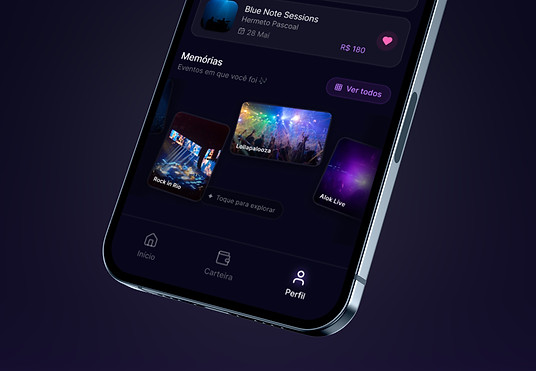
The design was built around three pillars: information clarity, continuous flow, and location-based personalization. All wrapped in the visual atmosphere of a live event.

ABOUT THE PROJECT
Type
Experimentation
Role
Product Designer
Service
UX Research · Design System · Prototyping · Motion Concept
Year
2026
Specifications
A solo experimental project developed during the Aprender Design course in 2026. Designed for iOS and Android using Figma.


References & Metaphors
The visual concept was born from two objects full of emotional memory: saved ticket stubs and concert photos. These artefacts captured the essence of the experience Snatch Pass aims to evoke.
The metaphors guided the microinteractions:
-
Stage lighting as a selection and highlight element
-
Light-driven transitions between event images
-
Cover flow inspired by LP organization for browsing events
-
Geolocation to personalize each user's experience

Design system
The system was built to sustain the product's atmosphere. The palette starts from a dark neutral, evoking the ambience of a nighttime event and an accented with purple and cyan, colors that echo stage lighting.